


Rose Runderkamp’s corporate identity
Name client
Rose Runderkamp Orthomoleculair Diëtist
Skills
Design | Project Management | Advise
About This Project
How would you market a dietitian practice? That was the question I received from the client. So we sat down and thought about the things that were needed. Would the basics suffice or were we going to go big? Where to begin when developing a corporate identity.
The beginning…
A company needs an identity. Once the name is set, this is often translated into a logo. But which look and feel are we going to go for? What will appeal to my audience and what will stand out enough for it to have its own identity? Are we going to use text, an illustration, or a combination of the two when it comes down to the design of the logo?
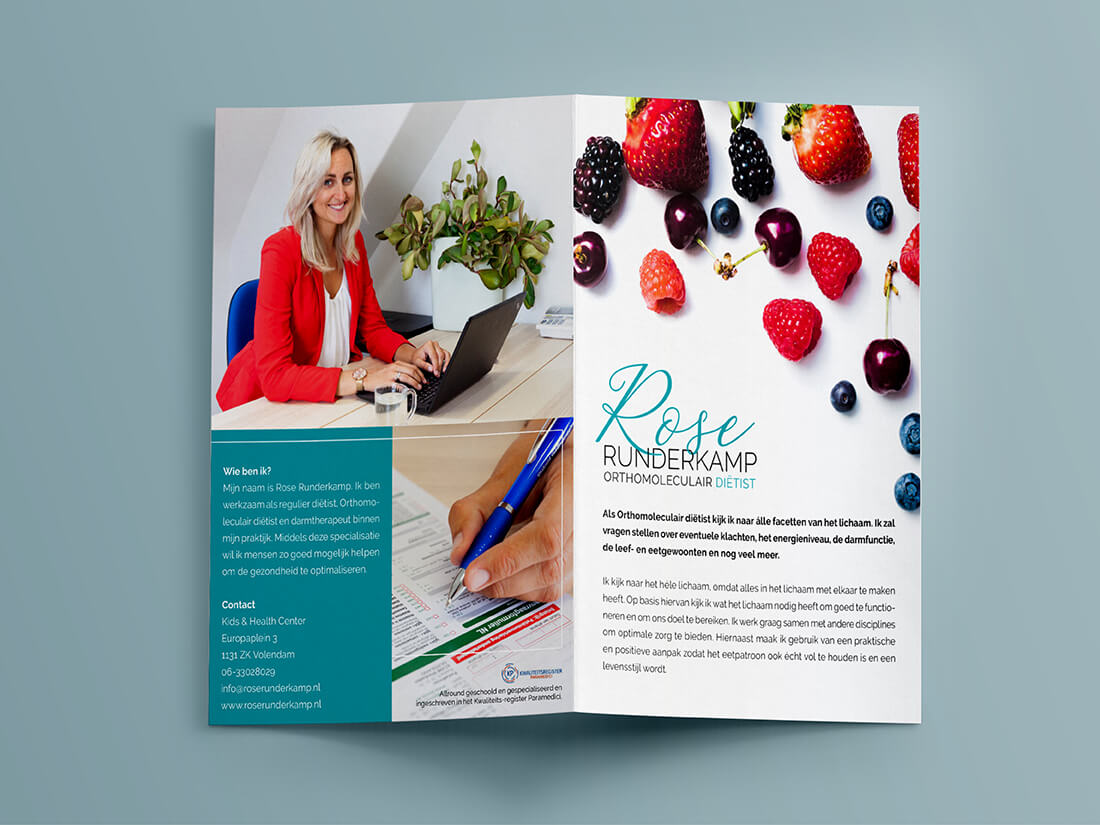
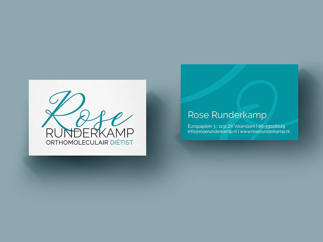
For Rose Runderkamp, we started with the idea of combining the letter R twice and using red as the basic colour. During the sketch process, it soon became clear that the letter R didn’t lend itself to being combined. So I designed a series of logos using the full name. It became clear that this was going to work best. With and without a payoff so it could be used in different formats.
Then the colour…
The client really wanted to go for red! But red was harsh and didn’t portray the friendly and open demeanour of the client. It might be a good idea but when you then see it you think ‘no’. Seeing it in red she soon realised this wasn’t going to work. I set off to work with a series of colour suggestions and soon the choice was clear that it was going to be blue. Fresh and fruity. Just like the photography in the brochure.
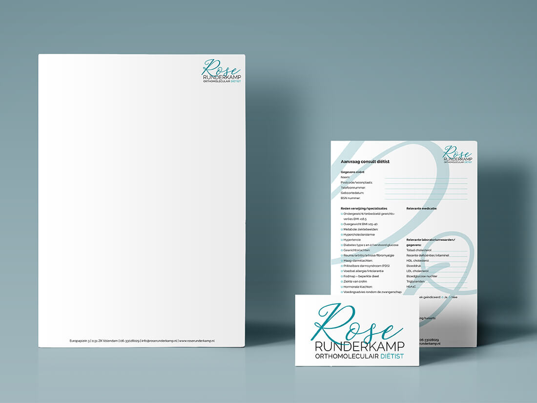
From logo to more
Once the logo was done, I could get to work on the corporate identity; a business card, a letterhead and a referral letter. I left the stationery quite blank so it could be used for various purposes. When creating the forms I started playing with logo elements incorporating them into the background. giving the form a little more body instead of it becoming a boring form.
And what do you give your customers?
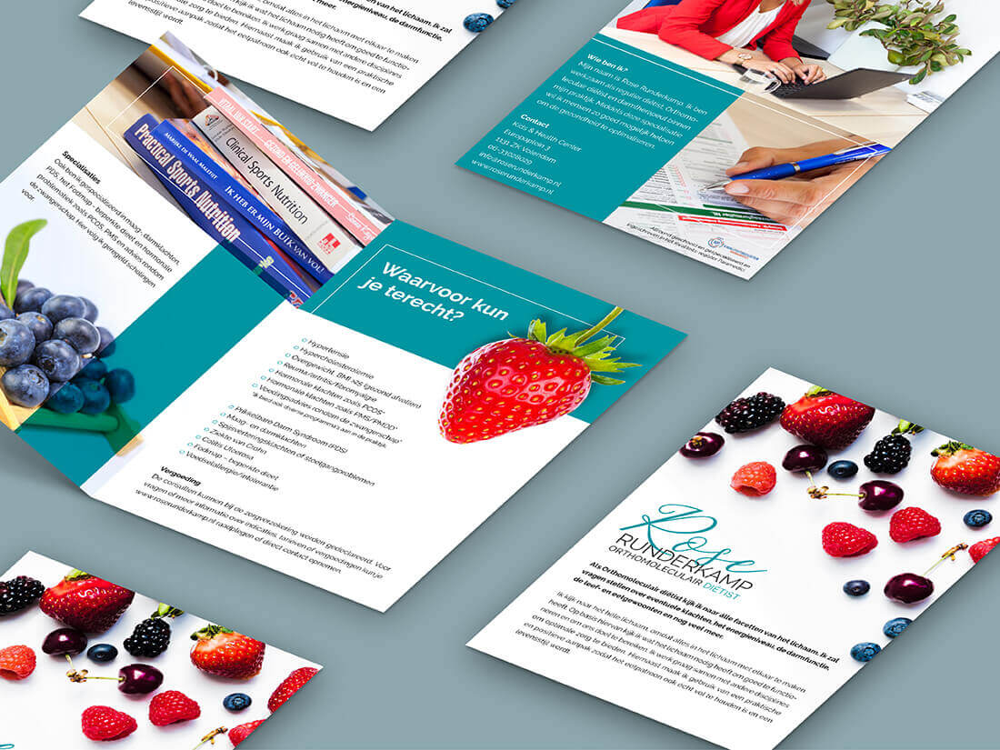
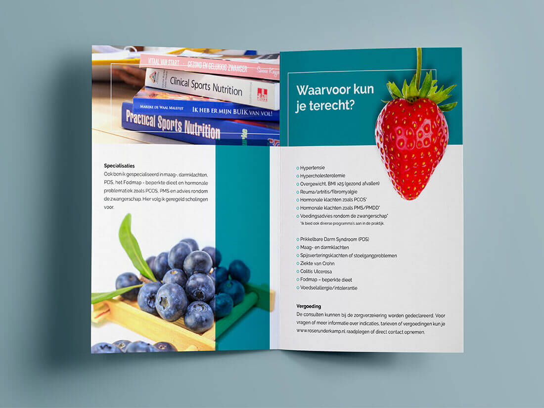
The client started off wanting 6 different flyers but we soon realised this wasn’t necessary. We ended up creating one general flyer to be used for everyone. The bi-fold design gives it extra space for more information and photos, and it feels like you’re holding a leaflet rather than a flyer.