


The Holyplex hair care product range
name client
Attitude Holland
Skills
Design | Project Mangement | Advise
About This Project
I was delighted when Attitude asked if I could help design the packaging for their Holyplex product range. I don’t often get packaging projects; I love doing them. Packaging is a world in itself. It needs a different approach to design and there are additional technical things to think about. When designing you need to make sure the design fits the product. An image on a box needs to wrap around but with a print on a bottle you need to ensure it doesn’t wrap around too far and become illegible. You must also take into consideration specific icons, a barcode and text that need to be incorporated into the packing design for safety and legal reasons. So often it’s a lot of text on a small space and in a font size that people can still read without needing a magnifying glass.
What was the theme for the packaging design?
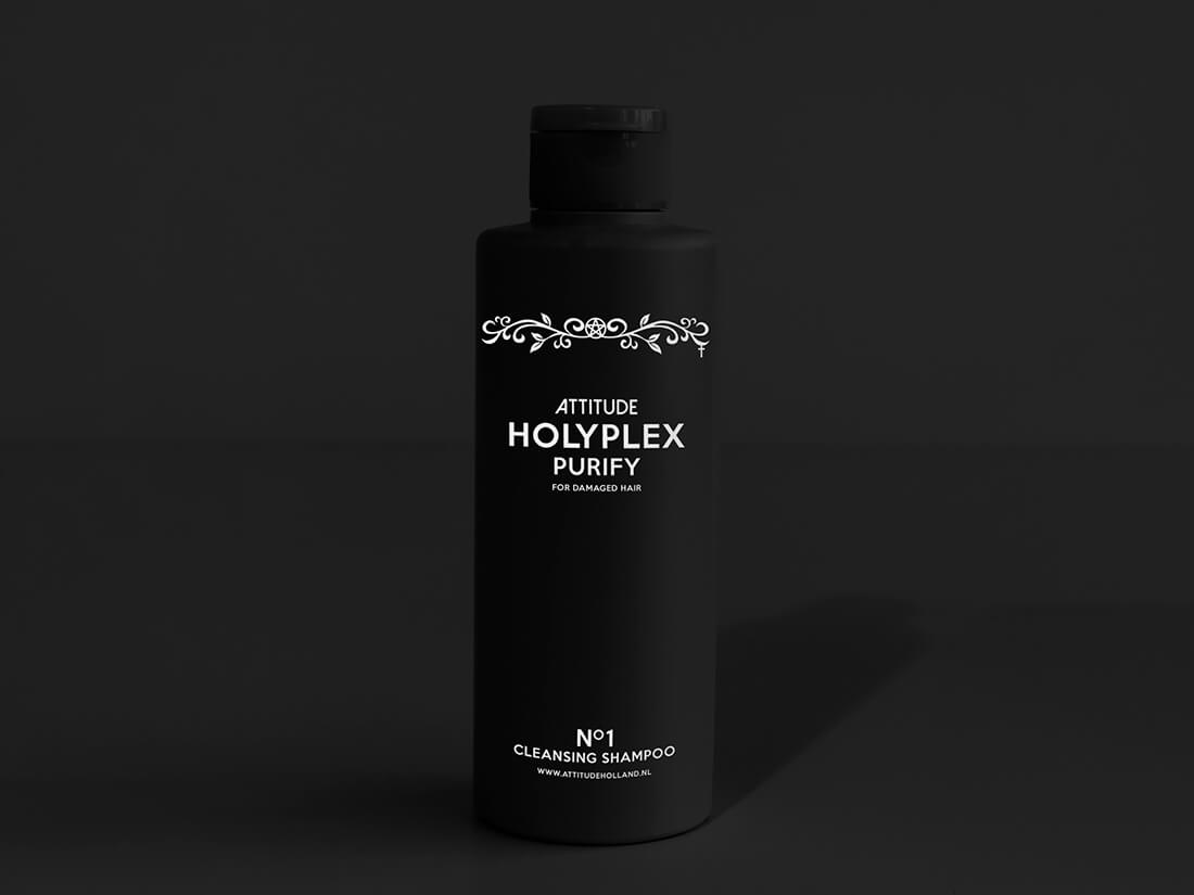
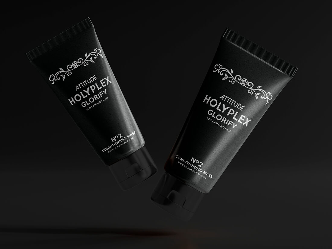
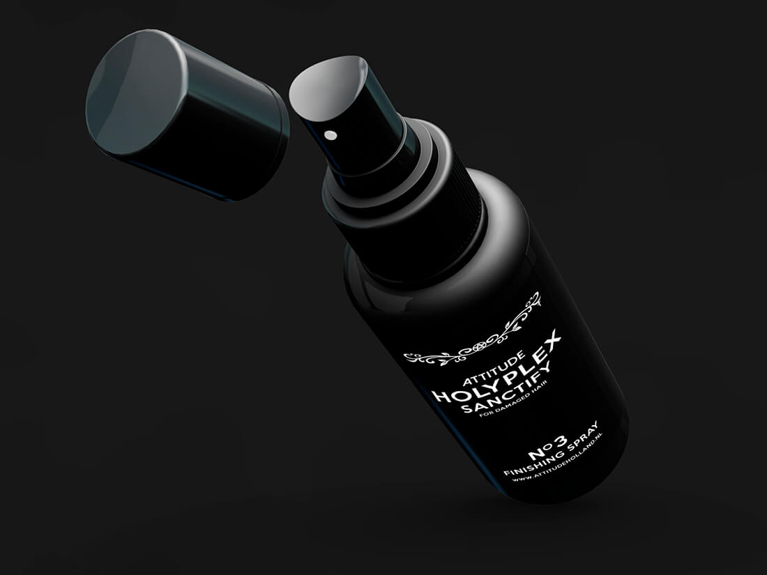
Attitude sells products aimed at the Gothic and Alternative market, so we devised a theme based on the bible. The name Olaplex was changed to Holyplex and I used religious symbols for the illustration. I used the Attitude fonts for the text in line with the company’s identity guidelines.
When designing the three separate prints I had to make sure the size of the illustration and text were relatively the same size across all three products. This was quite challenging as the tube has a big printing area and you don’t want the print to feel lost in the space. But the printing area on the spray was really small compared to the bottle. So, ensuring the three prints were the same size I spent time making mock-ups of the designs to establish the end result.
Printing packaging
The Attitude corporate identity uses black as its base colour which gave the production company a challenge having to print white on black products. We found that the white printed on black became grey and opted for a double print run so the white would really be white.
How many products did you design?
The product range consists of three products. A cleansing shampoo (Purify), a conditioner (Glorify) and a finishing spray (Sanctify). Each product was given a product name based on what it does and with a nod towards biblical wording. This was incorporated into the design alongside the product type. This way you knew you were grabbing a shampoo and didn’t have to guess if Purify was the shampoo or not.
Each product in the range can be used together or separately. Giving the customer the option of purchasing the set or just one of the products. The products are sold through their website and various online marketplaces like Bol and Amazon and are a nice addition to your hair care rituals.