


The rebranding of Success Schoonmaak
Name client
Succes Schoonmaak
Skills
Design | Project Management | Advise
About This Project
From time to time there’s no harm in checking if your branding is still up to date. Is it still in line with your current strategy and are you still in demand with your target audience? Or is it time for a spring clean? A detox so to speak.
With the handover of the company, it was time for Succes Schoonmaak to undergo a transformation on all levels of the company. The perfect moment for the Marketing and Communications department to instigate a deep clean and look at the current branding.
So, how do you start a brand detox?
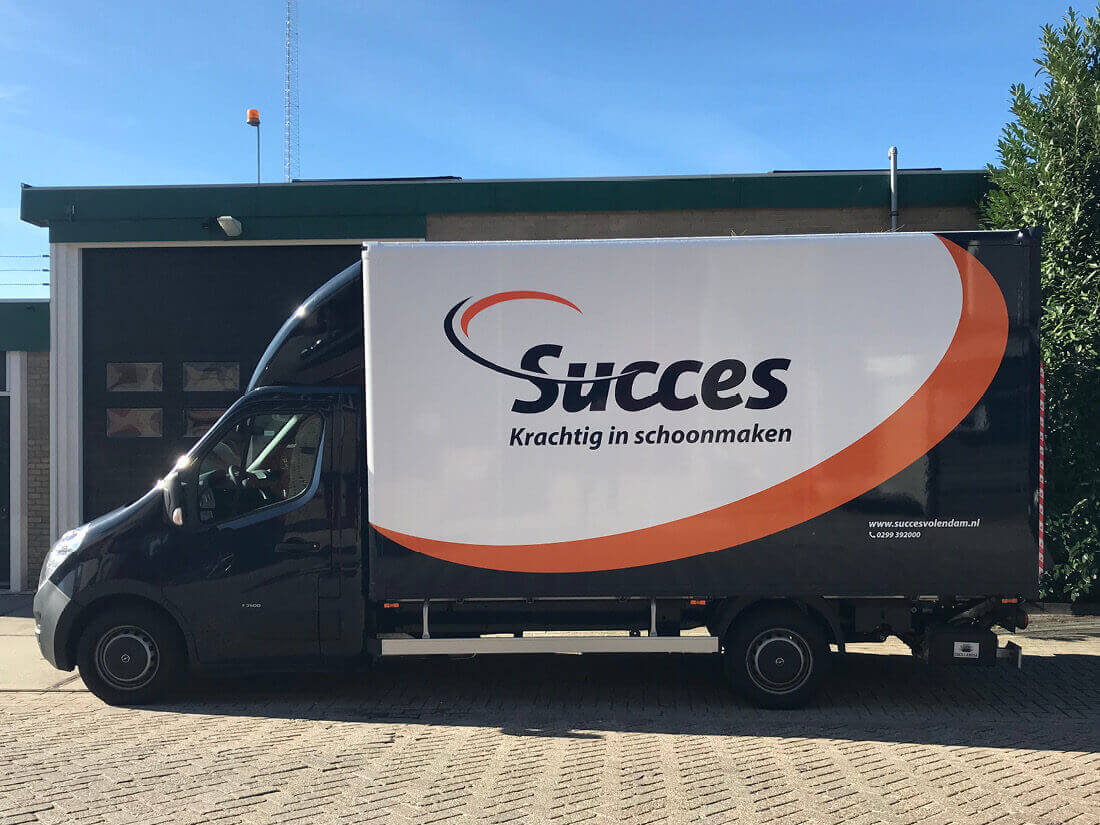
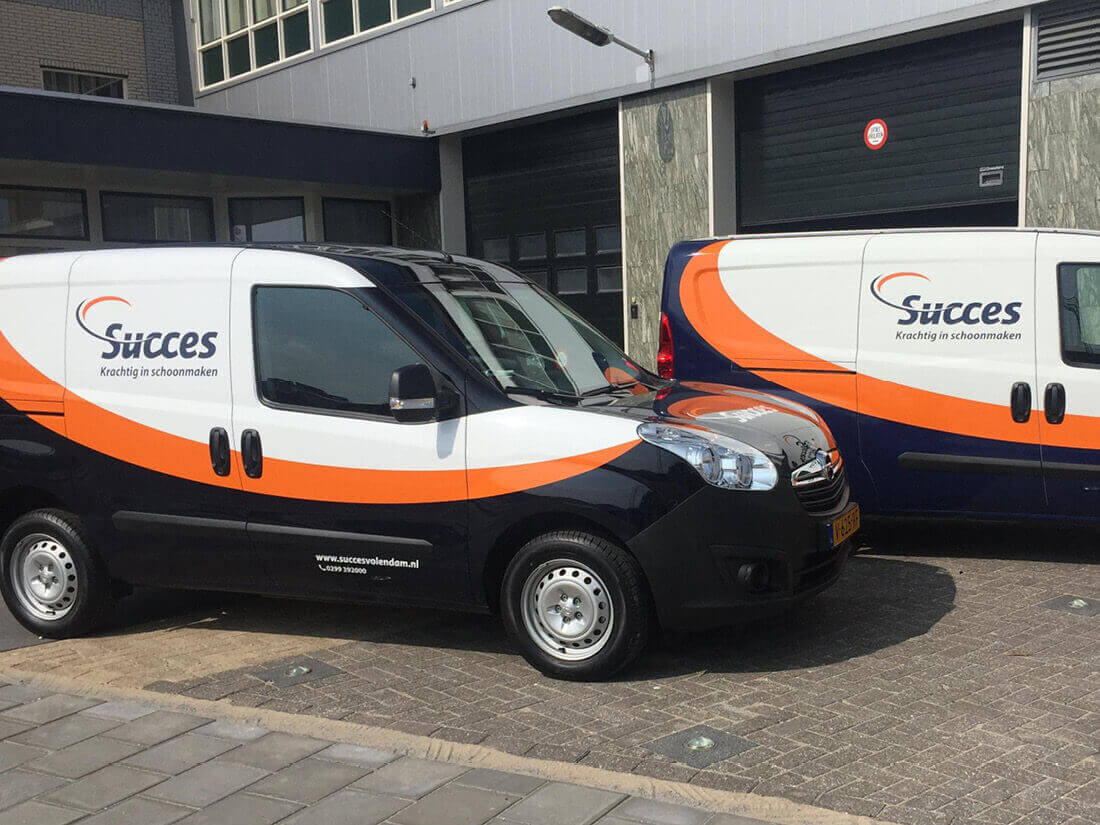
Well, this kind of happened by accident as the client and I were in a brainstorming session to discuss a new design for their tenders. As we were sitting there, we were told of a fleet of new cars being delivered that needed wrapping. Before we knew it, I started sketching a new design on a piece of paper deviating us completely from what we were doing. We took the design to the director who approved it and from there on, the ball started rolling…
The rolling ball…
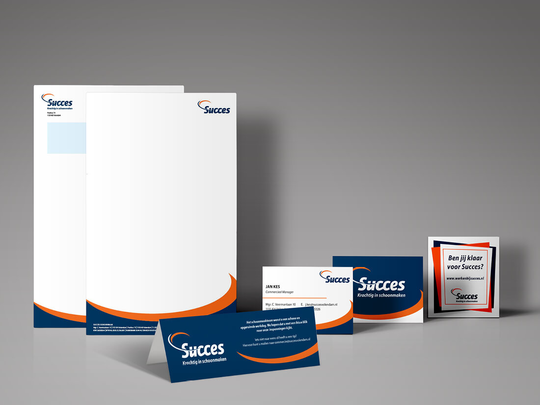
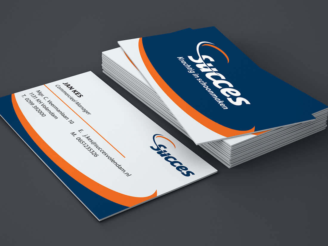
Looking back the adjustments we made weren’t all that big. A simple tweak of the colours created a completely different look and feel for the company. We changed the bright blue into a darker shade (closer to black) and brought the orange colour closer to the blue. Emitting a chic and stylish look and feel!
I took the ‘wave’ (schwung) in the S of the logo and converted that into an icon to be used as a recurring element across the board. These minor adjustments ensured that the identity of Succes Schoonmaak remained recognisable but enough for people to notice the new look.
New business cards were printed, we adapted the letterhead and digital templates and even got the style implemented into the website creating a strong identity seen on the road, online and in your hand.