


The Wischhoff brand
name client
Wischhoff Communicatieadvies & Projectmanagement
Skills
Design | Project Management
About This Project
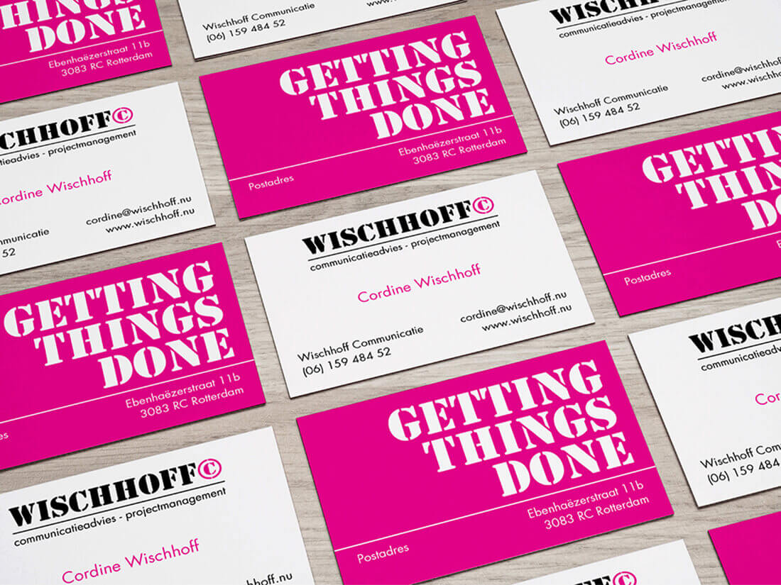
When it comes to developing a corporate identity for Wischhoff Communicatieadvies & Projectmanagement that’s both strong and feminine, where do you begin? Well, by asking my client several questions. Are there any specific colours you have in mind? What type of font style do you lean towards, and are there any specific wishes you have that I need to take into consideration? Another thing I do is look at the person behind the brand. Who are they, what are they like, and what vibe do I get from them? This way I can ‘feel’ what the logo and identity should ‘look’ like. Creating a look and feel that fits the person and the company.
Corporate identity development
So, once the questions have been asked and answered I start working on the designs. Colour wise the client leaned towards a bright pink, fuchsia. Bright, strong and a great base colour for the various materials I was about to create. Combining the colour with a strong illustrative font created this overall image of femininity, strong and powerful.
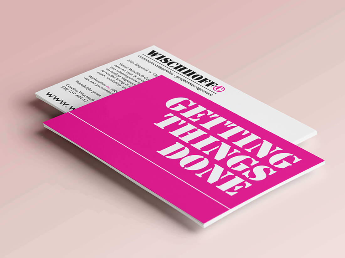
After designing the logo and business card I then created a postcard to promote her company which she sent off to potential customers in a direct mailing.