

15 Aug Does anyone ‘actually’ read text on a website?
Does anyone ‘actually’ read text on a website?
Ever wondered if people actually read all the text on your website? Well, they don’t. People tend to scan the text instead of reading it. That’s why it’s important to alternate text with images. The image is what tickles the visitor to read the supporting block of text. By alternating text and images, people tend to go back to it sooner when something interesting pops up during the scan. So, what should you pay attention to for people to scroll further?
Today, websites are the go-to medium to obtain information about a company. That’s why it’s important your website is up-to-date and accessible to the visitor. Too often I come across websites that are made up purely of text or have so much text that I just don’t know where to start reading so leave. You might think you ‘have’ to have all your information online, but even when you feel this is the case, it can still be broken down into bite-size pieces, so people don’t get overwhelmed and leave.
To ensure people don’t leave your website there are several things you can do. When starting from scratch it’s important to have an overview of all the pages and content you want on your website. And it’s good to look at imagery vs text. Your (web) designer will help and advise you on what you should and shouldn’t do. But, submerging yourself just a little bit into the world of websites will save you a lot of time (and money).
So, where do you start?
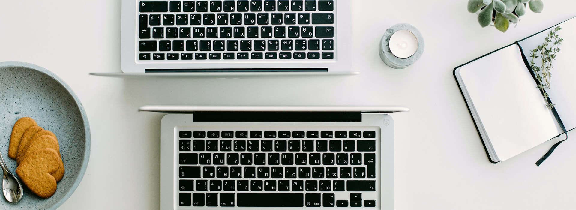
One of the things to look at are the images on your website and their relation to the text. Research shows that photos viewed with low contrast, poor quality, blurred, cluttered background or resemble advertisements are not popular. They give the visitor the impression that your product or service will be of the same quality. Another thing to consider is ensuring your photos aren’t boring, even when using stock images make sure they look real instead of that obvious American style.
When selecting your photos make sure they have a high contrast, are sharp and colourful, and have a serene background (not cluttered). Also, think of the relation between the image and the text on that page. If there’s no relation, select another photo. They need to complement each other as people tend to start reading the text after seeing an image that matches what they are looking for. When using people in your photos, ensure they are smiling, have a friendly face and are looking into the camera.
The best way to ensure the photography matches your company is to hire a photographer. Have them take pictures of your staff, your products, and your company. This way anyone visiting your website gets a true feeling of who and what you are.
Create an overview
Another thing that will help you with sourcing text and imagery is to create an overview of the pages you want on your website. For instance, your home page, about us, product overview, contact, etc. Then divide your existing content across these pages. This way you get to see where you’re missing information or needs deleting or adapting. It is also a good way of figuring out which photos go where and if you are missing any text or imagery. It doesn’t only save work when filling the website, it also saves time during the design process.
Tip!
Write down what you would like to incorporate into your website. Are there specific layouts or icons you would like? Or what about including your social media channels? A great place for the links is in the footer. Try to work as detailed as possible so that your designer can get straight to work without wasting time going through all the content and matching them to the correct pages.
Want to know more about creating your company website?
Book the Style Scan and I’ll gladly show you the process of having a website created for your company.
Book the Style Scan