Big in Mentorship
name client
Groot in Mentorschap
Skills
Design | Advise | Intermediary
About This Project
You’re about to start your own company and still need everything, but where do you start? The first thing we start with is your company name. What is your company going to be called and have you registered this with a hosting party yet, especially if you’re planning to have a website built? Once registered you have your URL and an email address.
How did the logo come about?
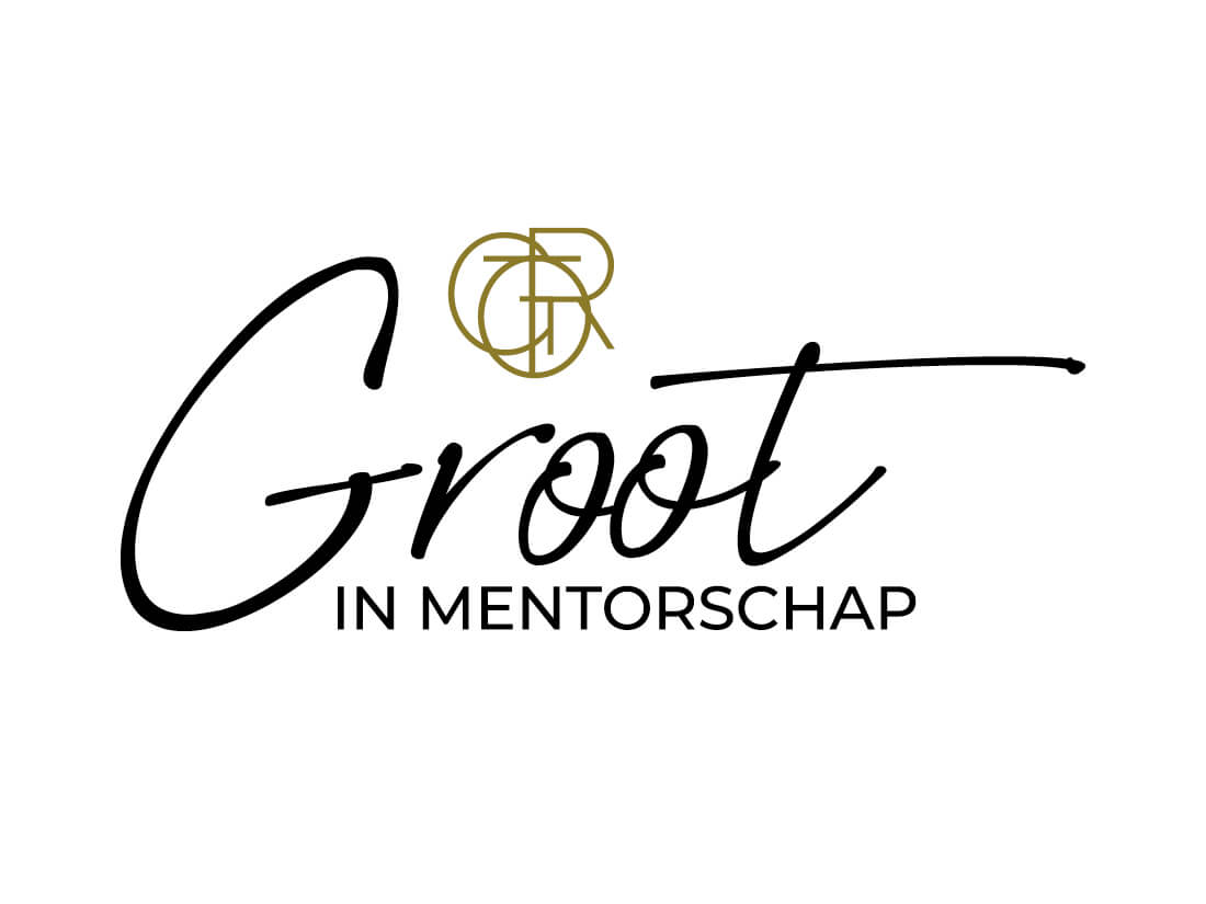
When I asked the client if she had any ideas towards the type of logo she had in mind, she mentioned that she wanted her name Groot to be the main focus and have a by-line to show what she does. And if it was possible to have an icon that would be great! Her first line of work is mentorship, but as she would like to add coaching to her portfolio, she asked me to take that into consideration when designing the logo so we can easily adapt the by-line rather than having a rebranding of her logo in the future. So, if you have future plans that you know of now, then it’s always good to mention this to your designer for her to take this into consideration during the design process.
For the icon is used the letters of the word GROOT and combined the letters to create an illustration. Icons are great when you want to use them separately from your main logo or incorporate them into a pattern to be used in the background of a presentation. A nice detail when you look at the icon closely. For the name Groot, she preferred a handwritten font and for the payoff and icon I used the same font only in different varieties.
How did you come up with the colour for the logo?
Choosing a colour for a logo can be quite difficult. The first thing I do is ask the client if they have any preferred colours, they want me to look at. Then I ask them about their core values as each core value represents a colour. Once I have an indication of the colour, I take my Pantone swatch book and seek out a colour that works well both offline and online. This way I can ensure there won’t be any colour differences. The golden-brown colour was chosen by her partner who uses this colour on his own website. The client felt that if she chose the same colour as her partner, the two websites would work well together making a collaboration between them a nice touch having matching styles. In addition, she had a photoshoot where the photographer used golden brown as the base colour for the background. So basically, it became a very logical colour to use. It wouldn’t quite be like I’d normally do it, but in the end, it’s the client who needs to be happy with the colour and how we get to it doesn’t really matter.
In a corporate identity you need more than just a logo, what else did you create?
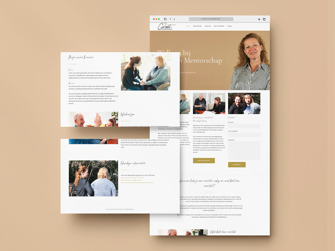
After finalising the logo, I started working on the website. When building a website, I use a WordPress template which I then adapt to match the client’s needs by adding and deleting sections of the template for the content to work.
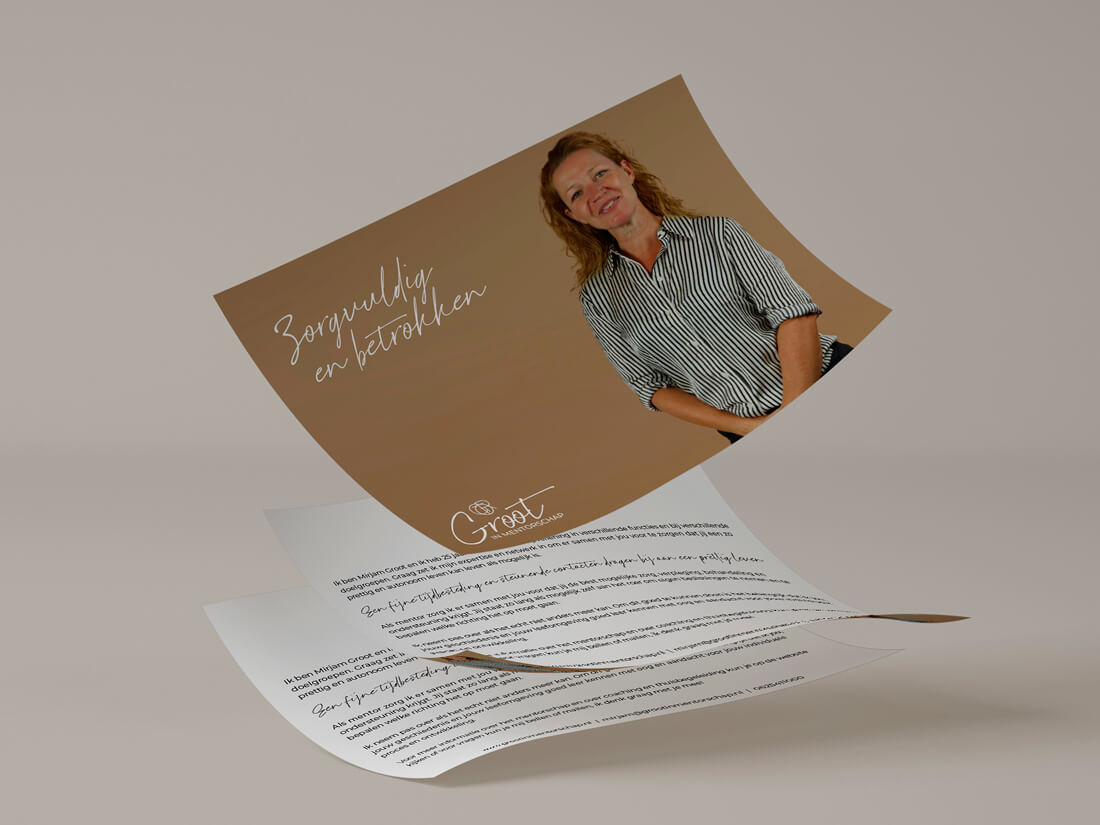
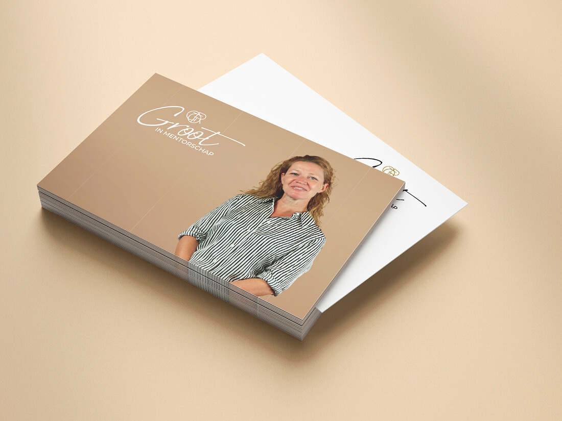
Once the site was finished, I created a flyer and business card for her to distribute. On the front, I used the same image as on her website creating recognition when visiting her website. All the items work well together and have the same style creating brand recognition amongst her audience.
Curious to see the end result?
Check out the website here: www.grootinmentorschap.nl


