


Get busy with GetBizzy Recruitment Agency
Name client
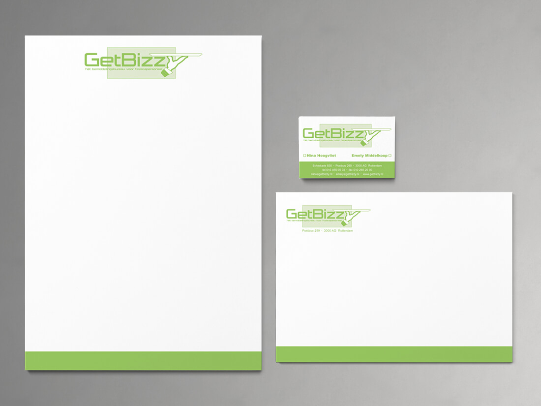
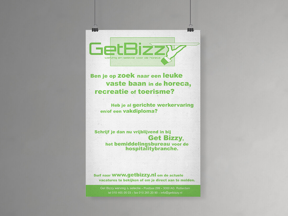
GetBizzy Recruitment Agency
Skills
Design | Project Management
About This Project
Whether your company sells a product or a service, every company needs an identity. This also applied to GetBizzy. A recruitment agency based in Rotterdam specialising in placing catering staff. The GetBizzy ladies asked me to design their logo and corporate identity.
The power of colour
GetBizzy was very clear when it came to their preference in colours. It needed to be a characteristic colour that also meant strength. This got us to green but not any green, it had to be fluorescent green. It’s known that green is one of the most difficult colours to print. So, when a client chooses a neon colour, you as a designer are happy Pantone has this colour in their swatch book, making printing artwork not a problem at all.
Hospitality as the theme for the logo
Whereas the colour of your corporate identity has an important role, colour alone doesn’t say much. That’s why designers add an illustrative element to the logo. This can be an icon or symbol and sometimes it’s a play of words in a nice font that create the visual side of the logo. Thinking about how to illustrate hospitality and recruitment brought me to a butler and his tray, and integrating these elements into the name, where the arm of the butler becomes the Y in GetBizzy. The result? See for yourself.