


New look for Marilyn Kledingreparatie
Name client
Marilyn Kledingreparatie
Skills
Design | Project Management | Advise
About This Project
Time for a new look!
Marilyn Kledingreparatie has been around for 15 years. A hobby which grew into a successful business. When Marilyn Kledingreparatie started there wasn’t time to develop a logo or corporate identity. She created something herself in Paint using Clipart and got to work. It became one of those projects on her ‘One day’ list. With the prospect of a new location and her 15-year anniversary, it was finally time to get professional branding.
How did the collaboration come about?
I met Marga from Marilyn Kledingreparatie at a networking event where I was a speaker on the topic ‘The importance of a strong image’. After the event, she approached me to schedule an appointment as she wanted to work with me. We sat down and it soon became clear what she was thinking about.
Were there any specific wishes for the logo and corporate identity design?
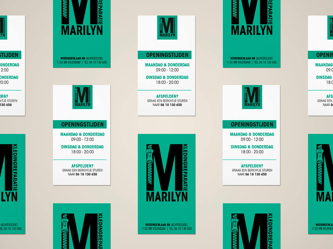
Before I begin designing a logo I start off with a bunch of questions to find out where the customer’s wishes lie. Starting with a blank sheet of paper never works out well, at least that’s my experience. In the end, everyone has a global idea of what they’d like for their logo. It soon became clear that the identity had to appeal to both men and women. Sleek, rugged and powerful! Green! Why? Because green is in line with her core values. As her speciality is replacing zippers, this gave me a great idea. I presented a range of logos and it soon became clear that this was going to be it.
And what about the colour?
When you select a colour for your logo, it’s important it looks perfect online as well as offline. Nowadays when you print something it’s a lot easier to get the colours correct compared to a few years ago. But you can still be unpleasantly surprised. Not all colours translate well from screen to print (or vice versa). So when I select a colour, I start off using the Pantone colour guide which shows the colours in various formats (HTML vs CMYK, etc). This way I can ensure that your online post looks the same as your flyer. What’s important when it comes to branding is that all your materials look similar when you put them side by side.
From the proposed colour range Marilyn Kledingreparatie selected a beautiful deep green. One that stands out next to black as black was her second colour choice. So once the logo was chosen, I got on with the rest.
Which items would you include in the corporate identity package?
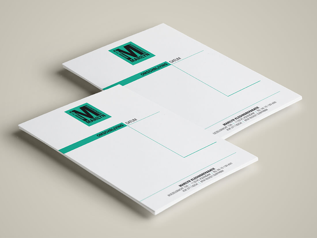
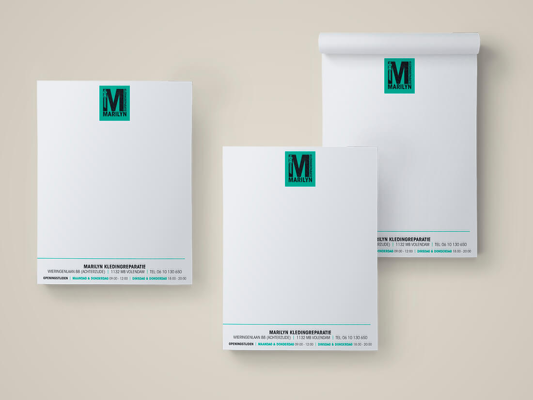
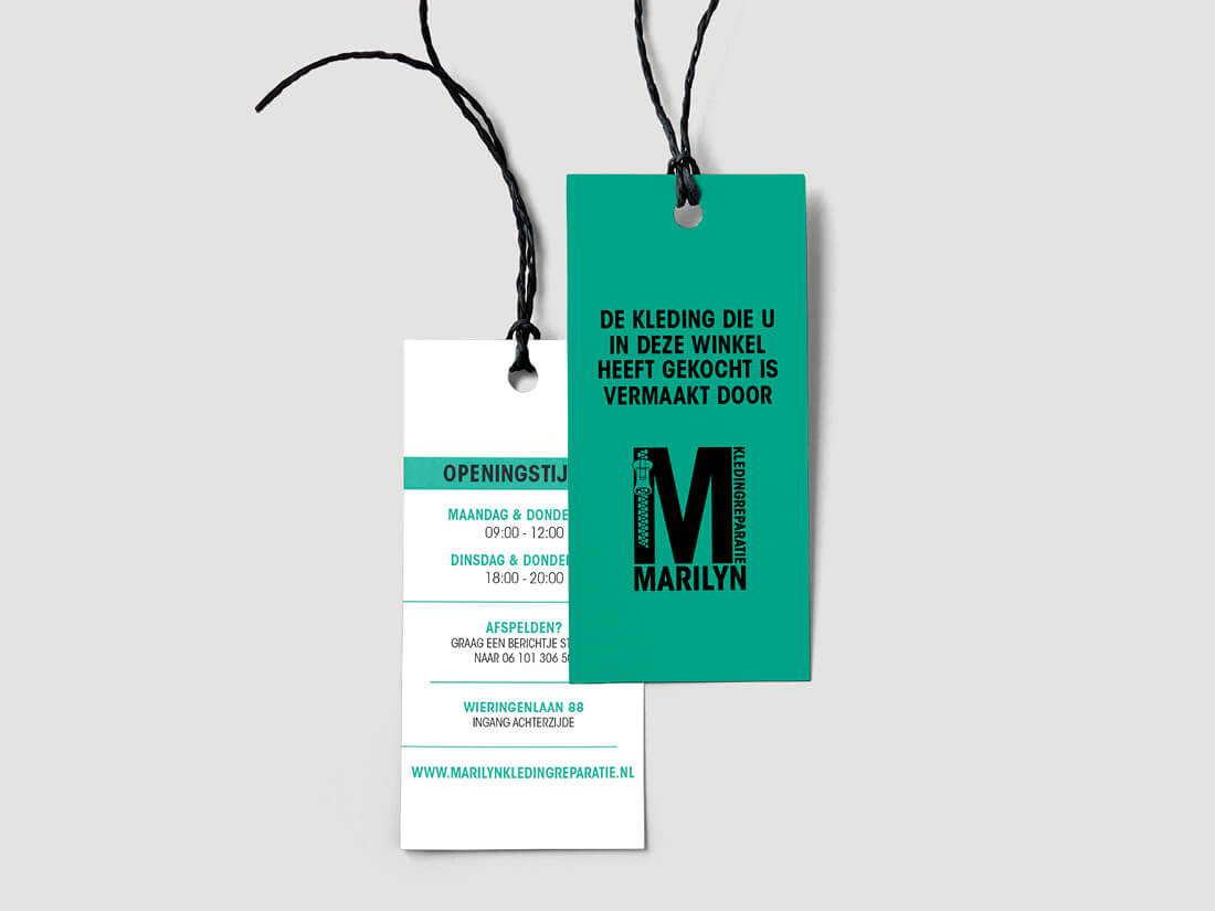
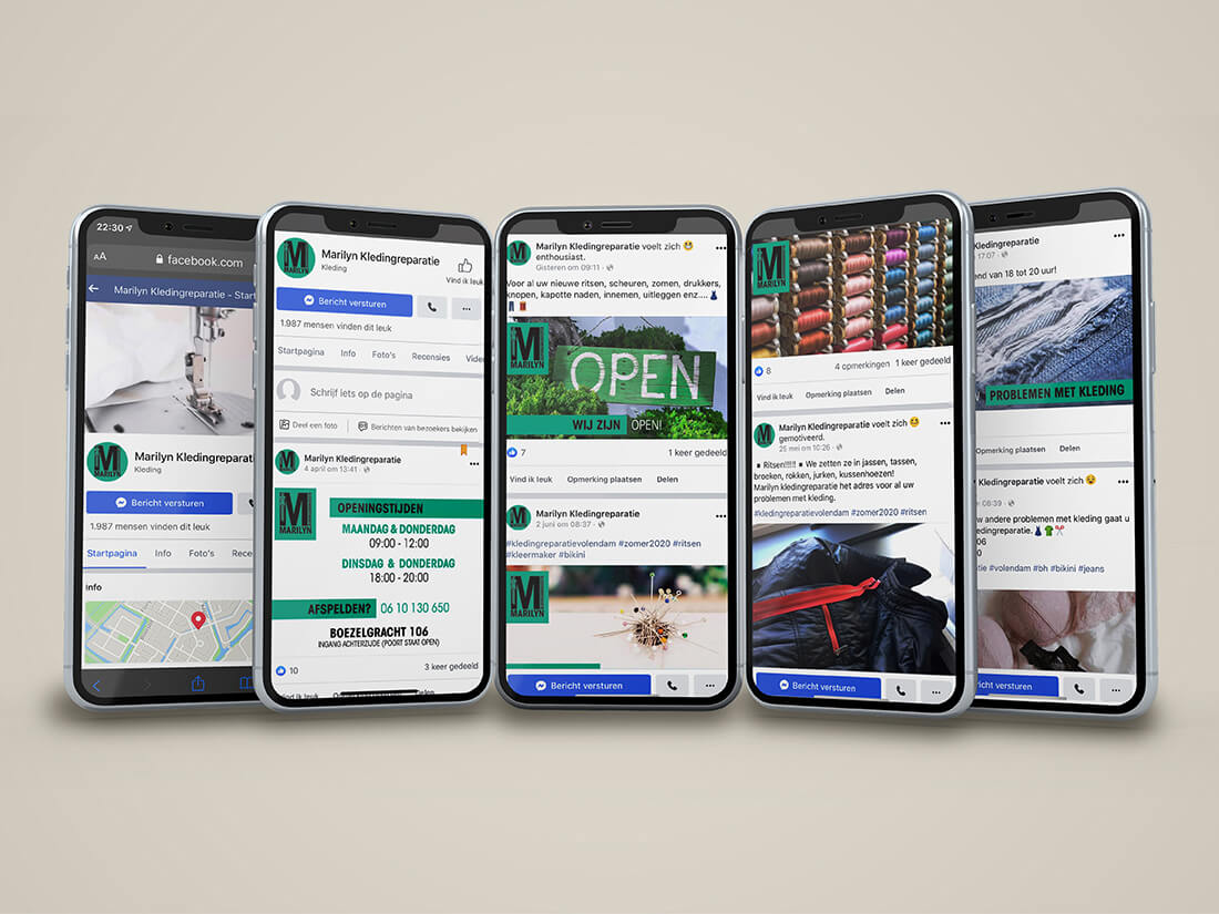
Being very active on Facebook my client requested a range of images she could use on social media. In addition to this, we created a receipts booklet and business cards. Later we added a flyer, website and business gifts to the package.
What’s to come…
Before the move, we set up a campaign to inform people of the move. A campaign aimed at the local newspaper and TV. We created a flyer as a handout, in addition to Facebook posts. Printed new business cards with the new address and produced a giveaway for the first 1000 customers. We designed wallpaper for her studio and awnings for outside.