Rebranding the Corporate ID for Boon Edam
name client
Royal Boon Edam International BV
Contract
Contract
Skills
Design | Project Management | Intermediary
About This Project
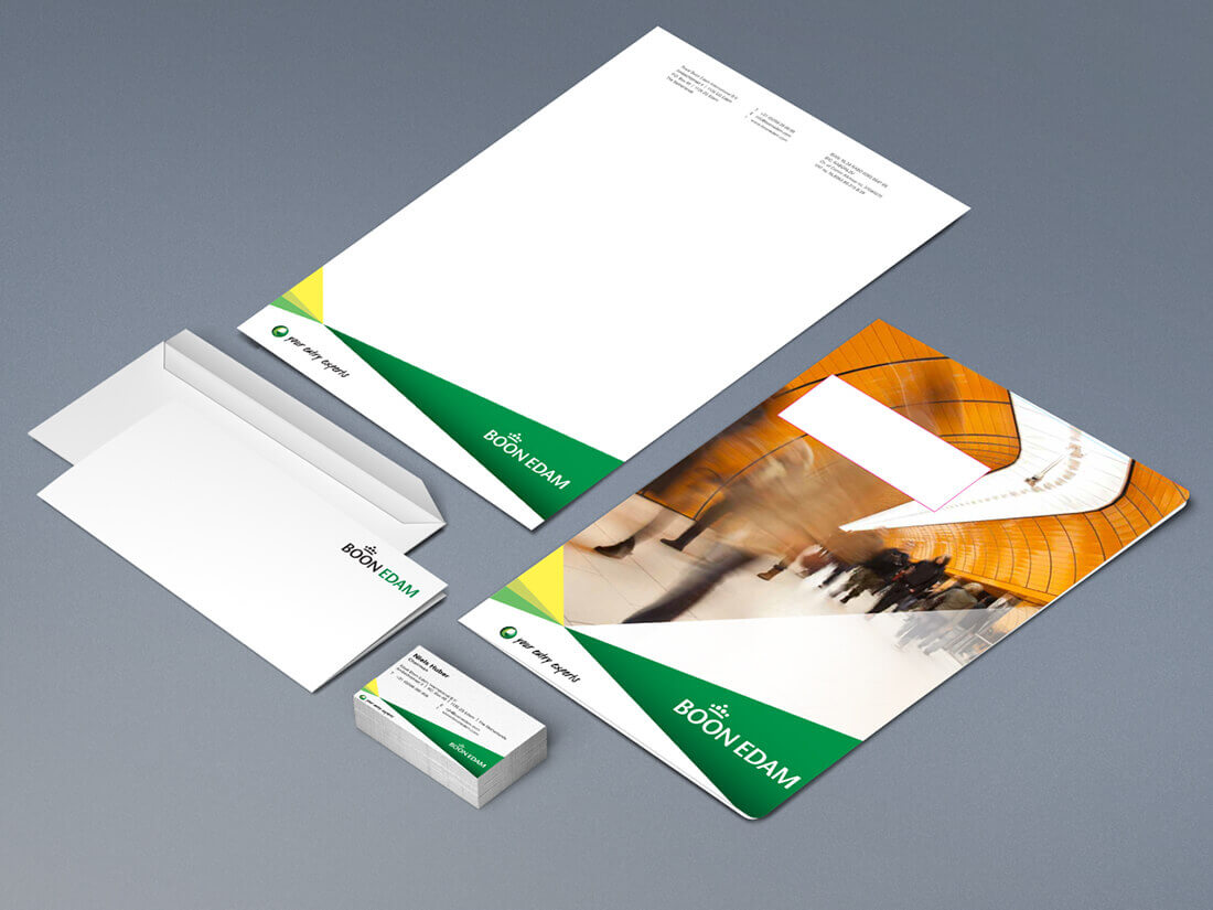
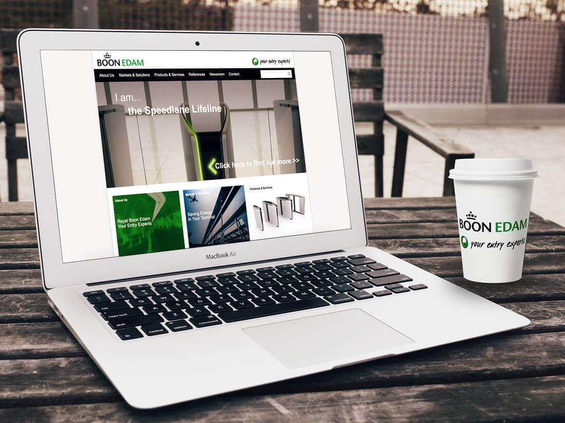
Royal Boon Edam International BV underwent a complete rebranding, but what does rebranding mean? It’s giving your corporate identity a complete makeover. Starting with a new strategy that’s then translated into the visual side of the identity. A new tone of voice, image and sometimes even a new set of colours or fonts. When it comes to the visual identity you always start with the logo. Does this need a tweak or a completely new look? And once you have the logo it’s time to look at the other elements of the corporate identity, business cards, website and even the fleet of cars.
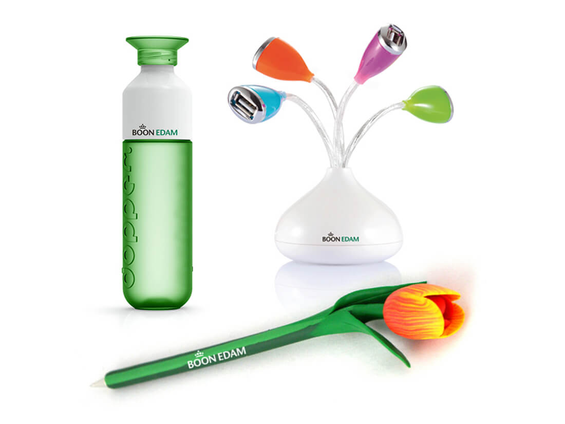
This becomes an immensely huge job for any company. And when you do undergo a rebranding, it’s important you take every aspect of the company and change the branding. Not just your website, brochures, and adverts, but also your cars, nameplates on the offices and business gifts. Even the logos on the products need to be replaced, at least when it comes to new products rolling off the belt. Everything needs to be taken into the rebranding, and for Boon Edam, it was my responsibility to guide the offline process worldwide.
What does a rebranding entail?
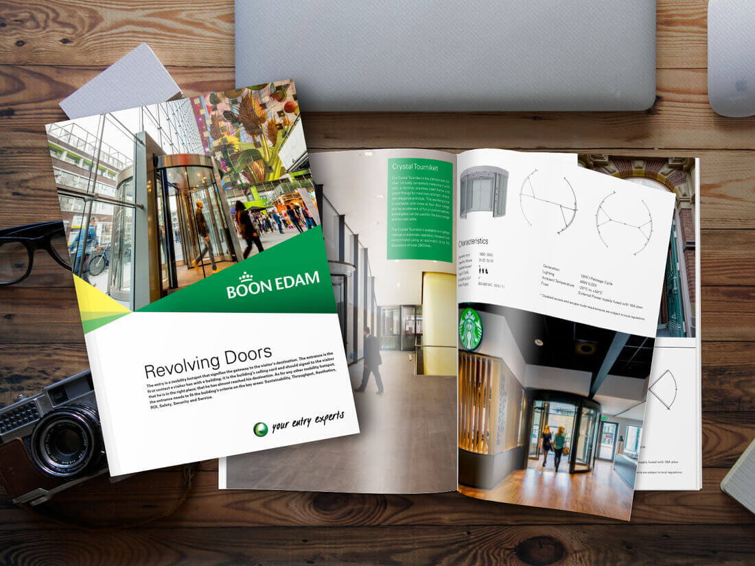
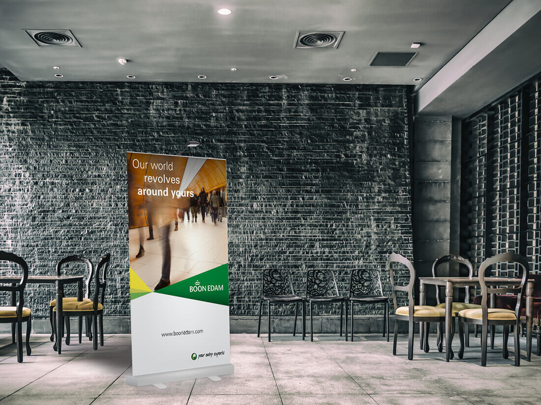
With every rebranding, you start with the basic elements and guidelines regarding the use of the new corporate identity. After receiving the initial outline of the new branding from an external design agency, I started the implementation. I soon noticed that the new elements were not quite suitable for the various materials I needed to design. When you’re implementing a new style created by a third party, it’s not unusual you hit snags. So, when this happens, you look at the snag, think up a workable solution and continue the implementation, not forgetting to write the new method into the guideline handbook for future reference. Once the snags were resolved I could start designing all the necessary marketing materials.
One of the new objectives within the strategy was to save costs by using preferred suppliers. So, when it came to the printing side of the marketing materials I went in search of new suppliers. For the European market, I found a party in the Netherlands (Huig Haverlag) to do all the printing and shipping. We found a printing company in the States to supply the American offices. And then we had China. Not knowing that the climate in China has a strange effect on ‘European’ paper (it starts to curl), it soon became apparent that China had different printing requirements compared to Europe and America. Hence us selecting a preferred supplier on every continent. The only requirement I had was that the colour and appearance of the printed materials remained the same. The only way I could ensure this would be the case was for each office to send me samples of their printed items and it soon became apparent that all parties were on the same page.
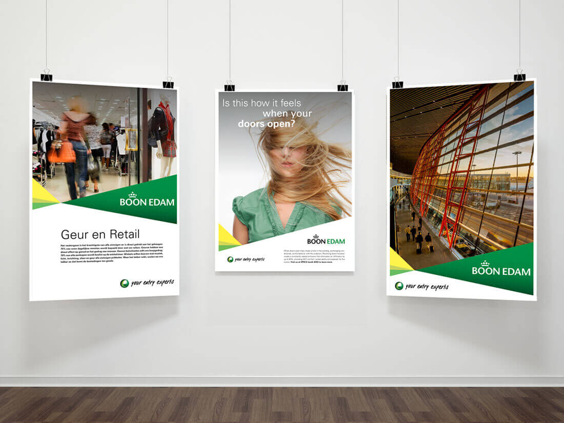
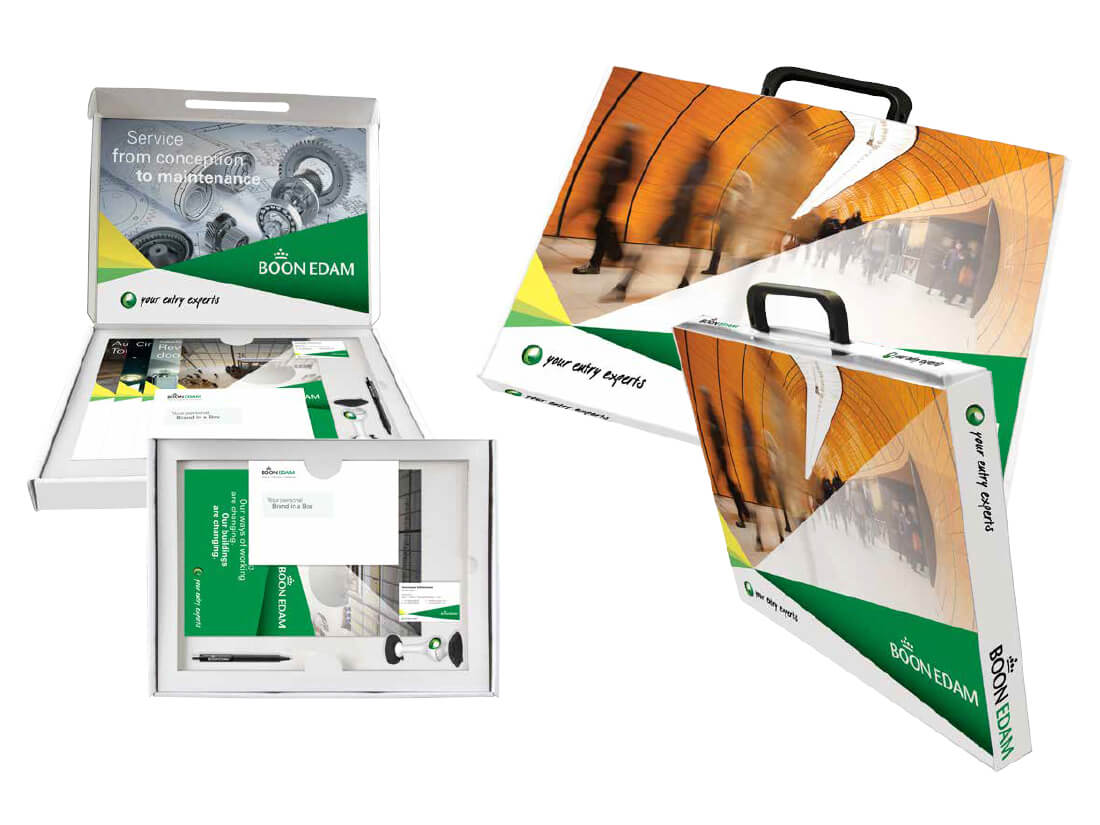
After creating all the marketing materials, it was time for the brand management portal. An online portal where all marketing coordinators were able to create their own brochures, adverts, flyers, business cards and other materials using the templates made available to them. This way I could ensure everyone was using the same materials and they had a custom-made version in their own language. The portal was linked to the various printing companies who then shipped the ordered materials to their office.
And that wasn’t all
Besides marketing materials companies also use other types of files and templates that needed the new style. And trying to get a grip on all that’s out there is quite impossible. I managed to get a good overview of everything that needed to change, even computer systems carry a logo that needed to be replaced. Where possible layouts were adapted to fit the new branding, but in some cases I needed to adapt instead of trying to change everything. As I hit snags with software limits and local policies that I needed to accept and take into consideration.
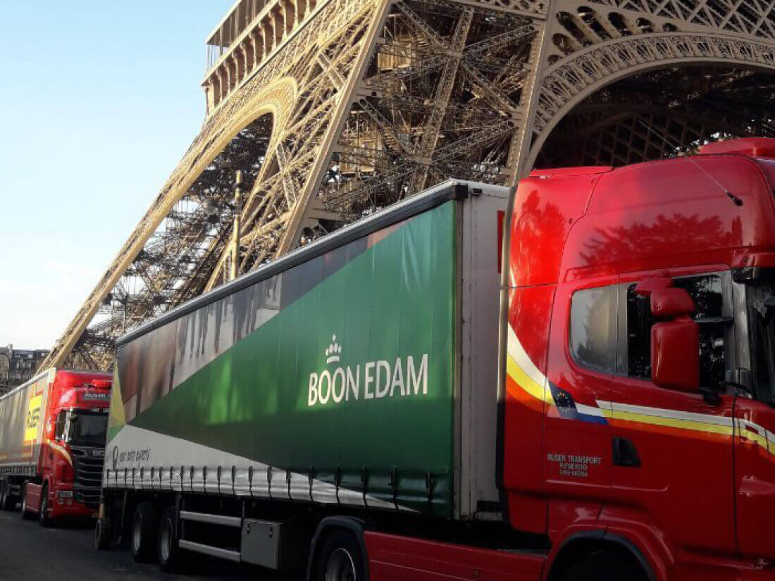
And then came the next part of the rebranding project. I’d completed the internal materials, but we also had offices that needed a new logo on the façade, signs outside the offices guiding visitors to parking spots, etc. The entire fleet of cars needed a new wrapping and with more than 150 cars, vans, and trucks worldwide again that was quite a big job. Within a period of 6 months, all cars were wrapped with the new designs. The grey cars became white, the white cars were re-stickered, and the trucks were fitted with new sails.
Boon Edam is situated in 20 countries worldwide. With 22 subsidiaries, this meant that all (marketing) materials had to be produced in not only 22 versions but also in 10 languages. Regardless of the preferences unique for each location. In the end, you’re talking about over 1000 brochures that I needed to design not forgetting all the other templates and items, I’ve lost count of the number of designs I created.
Proud of the new look!
After a year of hard work, I was finally able to enjoy everything that was made. Now 10 years later the company is undergoing another rebranding but at times I still see ‘my’ cars or truck drive along and each time it brings a big smile to my face. I loved this project and is one of the most treasured moments in my career. It was tough, hard work working with so many different offices and their local interest that needed to be taken into consideration. And in the end, all I can say is that I’m extremely proud of what I’ve accomplished. This was a dream come true for me and I’d love to do it again (actually, I did for Success – check their rebranding out here).