

02 May 5 tips for a designer look & feel in your posts
5 tips for a designer look & feel in your posts
As a designer, it can be painful to see how companies position themselves online. Even companies that have spent money on their corporate branding then decide to do their social media themselves instead of hiring an expert.
When entrepreneurs decide to do things themselves, they usually end up with content that actually has the opposite effect to what they have in mind. Reason being that hobbyists tend to do things where a designer goes ‘Oh no!’. So, to help you, I’ve listed the 5 most common mistakes and will explain how you can do this better. Don’t forget, the most important rule is to ‘ensure consistency!’ which creates recognisability and radiates professionalism.
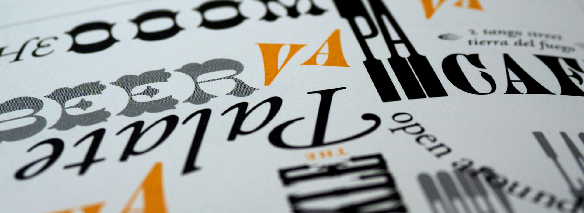
1. Be careful with the use of fonts
Where many hobbyists go wrong is that they choose a font that they like (at that time) instead of looking at the look and feel of the company. This results in varying posts where no strict guideline is followed. Or they do use correct fonts (in line with their corporate identity), only not in the correct way making the text appear illegible and messy.
Within a corporate identity you’ll supposedly never find more than 2 fonts. However, it’s possible that 1 font is used in various thicknesses. But there will also be guidelines as to how to use the fonts within your corporate identity.
If your corporate identity uses a font that can’t be used online, then find one that resembles the correct font as much as possible. Even better, ask the designer who developed your corporate identity which fonts to use for both online and offline materials. Or check the branding guidelines manual for more information.
Conclusion: If you don’t use your corporate identity font or use the fonts incorrectly, your appearance will always differ from your company leaving the wrong impression to your audience.
Hint! Always use fonts stated in your branding guidelines manual and never add another one. Follow your designer’s guidelines on how to use these fonts. If there’s no manual? Contact your designer for more information.
2. Hard to read text
Text isn’t everyone’s forte, but what you should pay attention to is that your text remains legible. It’s essential that everything is clear for the viewer. The number of times I’ve had to take a screenshot to then enlarge so I can read it is not funny. When a text is too small and placed on a busy background, I scroll right past it and don’t even bother trying to read it, meaning you’ve lost a possible customer and start looking for a company that does provide me legible content. Another thing to pay attention to is that the text isn’t too close to the edge of the paper or frame as this makes it difficult to read, running the risk of text falling off the screen. Always make sure that you work at least 3 mm from the edge.
Conclusion: Make sure your text is legible, even on a small screen. And especially when you place it over a photo. You need to trigger people and not give them any reason to scroll right past you. When people need to try and decipher your text, they don’t bother and look elsewhere. Increase your contrast, enlarge your text, and use a neutral background.
Hint! The easiest way to prevent this is by using a legible font and not one with a nice thin swash. Use short and powerful wording in a large font size. Use a neutral background if you want to place text on an image. Your goal is for the reader to not have to perform any extra actions to read your text.
3. Pay attention to the colours you use
Colours are a big part of a post’s appeal. The colour combination used can attract or scare people away. That’s why it’s important to take the time when designing your posts.
Many companies have a branding guideline manual that tells them exactly which colour codes to use within their marketing materials. They are mainly your primary colours also found in your logo and some companies have a second pallet of colours to work with.
It’s also possible that the designer has given you the option to select a colour that’s used in the image you’re using. This differs per company and if you aren’t sure, ask your designer for the best way to work with colours. When selecting your colour, it’s important to look carefully at the message. What is it you want to convey and what fits within your corporate identity? But also look at the legibility of your desired colour. For instance, when selecting a nice light blue, you’ll notice that this disappears when used on a light background. So, pay attention to the readability here as well.
Conclusion: Stay within the colours of your corporate identity or consult with your designer regarding the best course to take. And don’t forget the readability (contrast).
Hint! Not sure which colours to use for a post? Check the corporate identity manual for more information. When no specific colour palette is mentioned there, pick a colour from the image you want to use. Just be sure to pick a colour that stands out so you stand out as well.
4. Bad spacing
We all know how annoying it is when you’re in a crowded space. No one is happy then, as everyone needs their own space. Well, this principle also applies to images and texts. Give them space! If they’re too close together this will portrait a messy look.
Conclusion: Provide ‘space’ between the elements giving each element their own space to shine within your design.
Hint! For example, leave 5 mm space between the different elements so that they are not crammed together.
5. Align your objects
Under the guise of ‘space between all elements’, aligning elements is another one to take into consideration. You often see text and images not properly aligned. Or two images not aligned at the same height. When two images are next to each other, but one is slightly higher than the other, it looks messy. It can also cause irritation resulting in the customer not considering you to be professional and therefore continuing the search for a company that is.
Nowadays, tools like Canva make it very easy to ensure that everything is in the right place by aligning elements vertically, horizontally, left, and right. By placing a ‘grid’ in your design this is made even easier.
Hint! Get templates developed in your corporate branding where all elements are aligned with sufficient ‘space’ between them. Then all you need to focus on is the messaging and imagery.
Your turn!
Hopefully, these 5 tips have given you a little more insight into designing a good post. Of course, there’s much more to it than these 5 tips, but this will certainly help you on your way. And when you think ‘Yes, but pff how?’ then my advice to you would be to have social media templates created for you in your corporate identity.
Prefer some help?
Check the Social Packs page for more information or book the Style Scan. During the Style Scan, we take a look together at the possibilities and decide what suits your company best.
Book the Style Scan