

21 Jun Any idea why the colours on your website differ from your business card?
Any idea why the colours on your website differ from your business card?
We see colours everywhere, but do you know how colours are made? In the design world, we use various colour systems, each with its own function. For example, RGB, CMYK and PMS are three colour systems we use in the design world. You might have heard of them, but you might not know what they actually mean and when to use which colour system. So let me explain.
RGB
RGB stands for red, green, and blue. Three primary colours that create all the colours of the rainbow by adding light to them. This means that the more light you add, the whiter the colour becomes. And the less light you add (thus subtracting light from the colour) the blacker it gets. This is why most computer screens, from iPods to televisions, contain a grid of little red-, green-, and blue-emitting light sources.
RGB is made up of three colours each with a maximum value of 255. When all colours are set to 255 you get the colour white. And vice versa, when all the colour values are 0, you get black. Remember, white is not a colour (I’ll explain another time). And in terms of RGB, it’s white light that shines through.
I’ll take orange as an example. Orange in RGB is 247/148/29. This means:
Red has a value of 247
Green has a value of 148
Blue has a value of 29
HTML
The online world takes place on screens. That is why RGB colours are used in the online world. But because we are now dealing with computer code (HTML), this is displayed differently than RGB.
If you want to know the colour code of your corporate identity because you want to enter it into your website, you switch to the hexadecimal value or HTML colour code. This is the ratio between red, green, and blue and is made up of six numbers and numbers. Take our example colour orange, that’s #F7941D. The first two characters after the hashtag represent the percentage of red, the middle two represent the percentage of green, and the last two represent the percentage of blue. But don’t forget to add the # otherwise the code means nothing, and the software can’t read it.
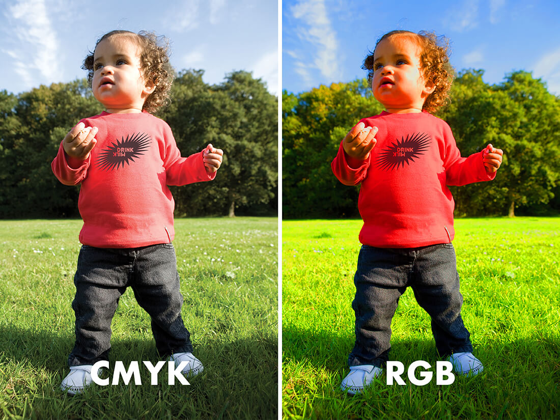
A very important factor is that RGB and HTML colours are NOT suitable for printing. This is because your printer uses 4 colours – CMYK. And, no light can be added, meaning the many bright colours cannot be imitated.
CMYK
So, what is CMYK? CMYK is used for printing and another name for it is full colour. CMYK stands for Cyan, Magenta, Yellow and Key (black). The black is used to create beautiful dark colours with less ink.
If you want to print an RGB image, you must first convert it to CMYK. Only, what you often see is that as soon as you convert the image from RGB to CMYK, you see a slight colour difference. RGB colours converted to CMYK often become a faded when printed. Why? There’s no light added to mimic the brightness of the colour. If the slight colour difference is important to you, you’ll have to use Photoshop to manipulate the image to mimic the colour as much as possible. These days technology is so advanced that a complicated and expensive programme like Photoshop isn’t always necessary when converting images from RGB to CMYK.
The CMYK colour values are made up of a percentage per colour. Each colour can reach a maximum of 100%. The combination of these percentages becomes the value of the colour you desire. The higher the percentage, the more ink that is used, thus the darker it becomes. When printing you’ll notice that each colour is layered on top of the other and as they are transparent will blend into the desired colour. Using our colour orange as an example, orange is made up of 0/50/100/0 that is:
Cyan 0%
Magenta 50%
yellow 100%
Black (Key) 0%
Pantone (PMS)
And then there’s the Pantone colour system, in short PMS (pantone matching system). You won’t encounter these colours in everyday life, but they are indispensable for designers in the graphic design world, textile (fashion) and other industrial fields. Most people know RAL and will automatically think in those terms, but RAL is something entirely different and a colour system not used for printed materials.
PMS colours ensure that all colours are always exactly the same. Unlike RGB and CMYK, where you create other colours by combining colours, PMS uses separate inks per colour. The great thing about PMS colours is that they are used worldwide so you are guaranteed to get the same colours across the globe. In our example, our colour orange has the colour code PMS 021.
PMS colours are often used when you only want to print 1 or 2 colours. For instance, when printing a promotional gift. It’s cheaper than printing full colour (so four colours – CMYK). Nowadays printing in four colours (say full colour – so CMYK) is a lot cheaper than a few years ago, thus PMS is now mainly used as the fifth colour.
Fifth colour? But a printer only has four slots, right?
Yes, your standard printer only has four slots, but a printing press can add up to 3 extra colours to a print run, giving you 7 slots to work with. The first four are always used for the CMYK colours, the fifth is usually a separate PMS colour and the last two are used for finishing materials like a UV layer, or lacquer or could be used for a second or third PMS colour (which isn’t very common). The extra slots make it possible to add some effect to your print work. It can also be used when your corporate identity has a specific colour (i.e., a neon colour) that can’t be reproduced using CMYK hence PMS coming into the picture. Colours like gold and silver or other metallic colours are also printed using a PMS value.
But how do you ensure that your corporate identity colour looks the same on all communication materials?
Your designer will pick your colour palette when designing your corporate identity. She’ll look closely at how the colours translate when converting RGB in relation to CMYK and vice versa. If you don’t do this properly, then you’ll notice that the beautiful neon green on your screen becomes a dark green on paper, which is not what you want. You would then print using the neon green as an added fifth colour. But don’t be fooled, as the type of paper you use will also influence how the colour turns out. This is why your designer will select values for coated and uncoated paper so you’re always using the correct one when using a fifth colour. The difference is indicated with a U or C after the colour code (e.g. PMS 021 C / PMS 021 U). If there’s no letter added to the number, the printing company will set it himself depending on the type of paper he uses.
When I design a logo or select a corporate identity colour, the first thing I do is grab my Pantone swatch book. I usually use the Pantone Colour Bridge swatch book as it not only shows PMS but also how it translates to CMYK. This will then show me immediately how it will look on paper and whether it differs a lot. If it deviates, then I choose a colour that works better. In addition, this swatch book also shows the codes for RGB and HTML giving me the right codes for when building the website. If you want to know which colour values are used for your corporate identity, then check your brand manual as they should be in there.
To summarise…
RGB is used for displays such as your phone and computer screen.
CMYK can be found in your printer and therefore on paper.
Pantone colours are colours with a fixed value that are the same everywhere.
Reading tip!
If you’re planning to have a logo and corporate identity designed, read the following article; The importance of the right colour in your logo. To see examples of logos I’ve designed, check out my portfolio.
Curious about knowing if your colour values all match?
Book the Style Scan and I will be happy to take a look with you.
Book the Style Scan